Impressionist painters Study
Becoming an artist is not such an easy thing to do. Sure, one needs to have a certain aptitude for art, and one needs to enjoy doing art too. But sometimes we need to study, to look at the greats and see how they might have produced their paintings. I, for one, have to take my hat off to them, for they painted in the field, street or waters edge and I’m not that kind of a painter. Call me soft if you like but I like the warmth of my home studio when I paint.
Anyways I was on Facebook (in my warm studio) and saw a free course called “Paint the Impressionists” it is run by the Learn to paint acadamy and I signed up too straight away because I was already looking to advance my painting. The course had a great online community and I spent the week with them and just got stuck in. We would paint and then post and was great seeing everyone else work. Everyone was at different developmental stages, and a very encouraging environment to be in.
The one thing that the greats and I have in common is speed, they needed to paint fast to capture the light before it disappeared, this gave their painting a real sense of movement, depth and feeling.
I on the other hand just love to paint fast to capture the light (as that is captured in the photograph) but to capture the feelings I have whilst painting, and this too gives me the sense of movement and dynamics I want to portray in my paintings.
The great impressionist painters like Monet, Korovin and Streeton were absolute wizards when it came to colour. They knew how to make the light glow and used that knowledge to great effect in these three paintings that I used in my study, and this is something that I wanted to get to grips with for a while.
The other thing that they use to do, was to use a limited pallet. I don’t mean just use blues, or greens only. But to use maybe five or six colours. I think this was mainly because they were Plain Air painters and needed to carry little amount of equipment with them as possible and paints were seriously expensive too. Today we have the luxury of any colours we want, but I feel that that can lead to a painting that lacks continuity and togetherness.So I too limited myself to just 6 Colours for all three paintings: Primary Blue, Yellow and Red, (of which any colours can be made) However, I also used Prussian Blue, Raw Umber and White.
These paintings are not copies of the originals but studies of the paintings. Whilst the content of the artwork is similar I did not try to duplicate the painting. Instead, I focused on elements I wanted to improve in my own work and painted from the feelings I had for these most amazing artists
Korovin – Paris. Seine
View Korovis, Paris. Seine-1902 on the web
What I and wanted to achieve
The main thing about this painting that captured my imagination was the movement of the water. It’s obviously a bit of a dull windy day. Yet Korovn managed to make the reflection of the buildings glow on the water’s surface.
He also used the trees to lead one’s eyes towards the direction the little boat was travelling. My main concern was the blues and greens mixing to make a muddy brown, which would make the water lose its vibrancy.
So I set out with these three things in mind:
Keeping a clarity in the water (no mud)
Painting the buildings very loosely
Make the trees have movement to draw the eye towards the bridge and boat
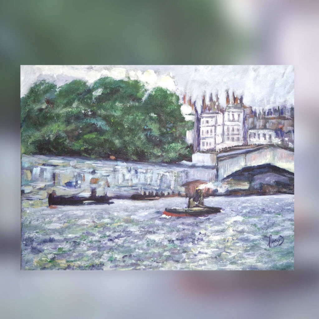
Paris. Seine
Materials
Liquitex heavy body paints
Liquitex Satin Varnish
Premium quality canvas board
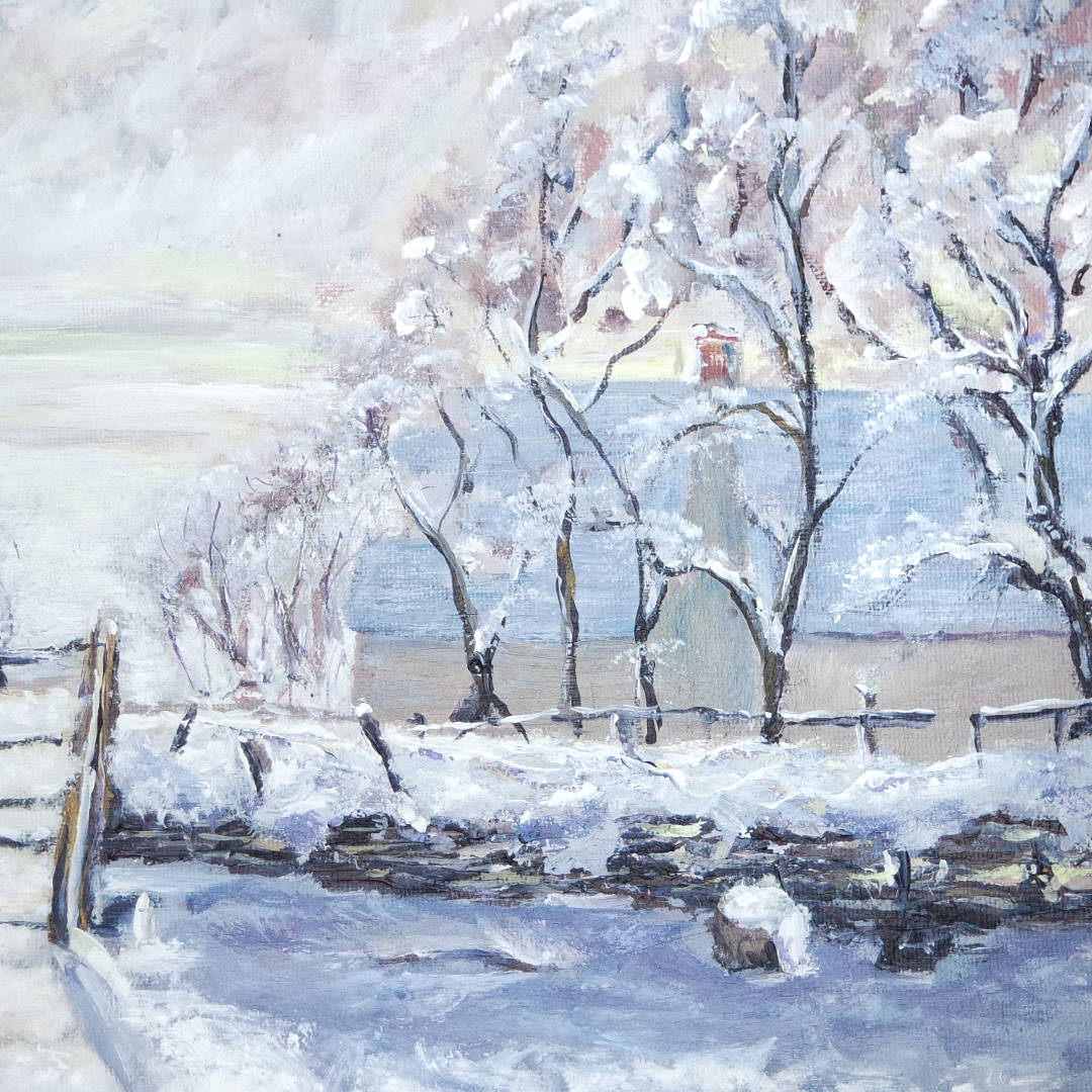
Monet -The Magpie
View Monet, The Magpie on the web
Monet is one of the greats and I Love his work!
So when I was told that I was going to be painting one of his pieces I was both excited and very nervous. We were given a very blue version of the Magpie to use in our studies, but I had found a very warm version. So I set out to paint a cross between the two. I loved the Irredecent sky and the way the light glistened on the snow through the gate. The angle of the trees and the shadows lead the eye towards the gate and the magpie.
Snow is not white, it is the colour of whatever it is reflecting from the sky Mainly and its surroundings.
So I set out with these three things in mind:
Really focus on the light and keeping the iridescence
Keeping the angle of the trees and the shadows
Portraying the shadow colours with reflections in them
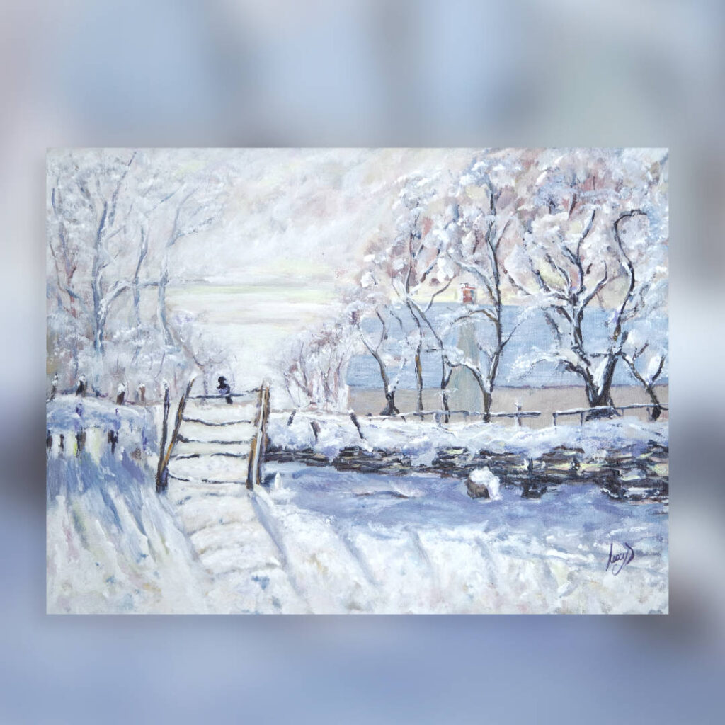
The Magpie
Materials
Liquitex heavy body paints
Liquitex Satin Varnish
Premium quality canvas board
Streeton – Near Heildelberg
View Streeton, Near Heildelberg on the web
Arthur Streeton is not such a well know artist in the UK but is renowned in Australia. This painting was an absolute joy to paint and was a little closer to my style, so was pleased that this was the first in the challenge.
I loved the unformed flowers in the front of the painting, just lines and dots. The tree was pretty knarled and there was a long discussion about what on earth the lady was doing. Holding up her arm, or was it a parasol? we did not know. The clouds seemed to swirl around the tree, as to give it a frame and keep your eye on the path and the lady.
So I set out with these three things in mind:
Focusing on the clouds and the swirling
Make sure the path stood out to lead your eye through the painting
Keeping the unformed flowers in the foreground.
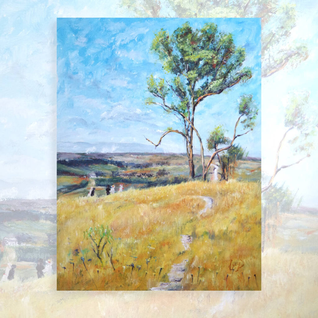
Near Heidelberg
Materials
Liquitex heavy body paints
Liquitex Satin Varnish
Premium quality canvas board
Good post!